
Diametos
Giving Control Back to Users Through Thoughtful System Feedback
We designed a solution to put users feel at ease during one of the most critical junctures in Snorefox’s user journey.
Snorefox helps users conduct sleep studies in the privacy of their own homes
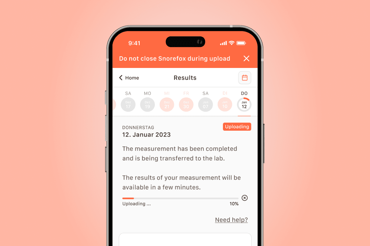
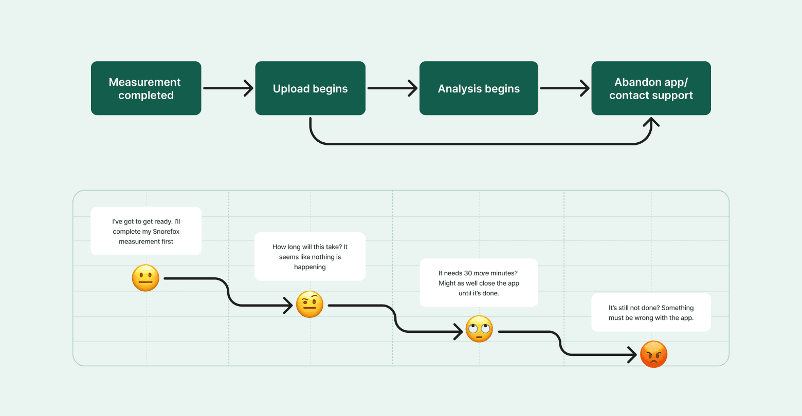
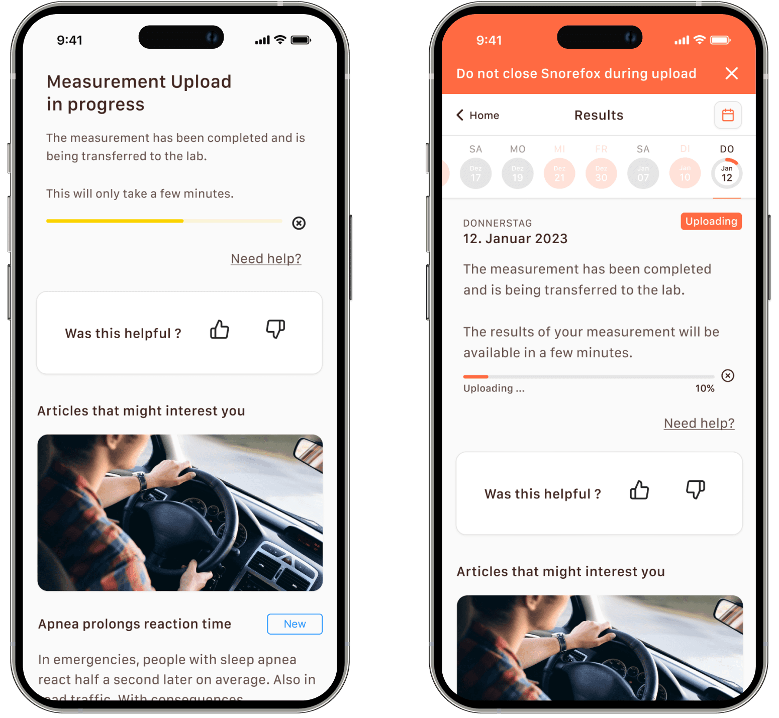
Diametos’ B2C product, Snorefox, enables patients to conduct sleep studies at home by recording breathing patterns during sleep and then, in two separate processes, uploading and analyzing them for abnormalities. Measurement upload takes several minutes and analysis can take up to 30. Closing the app during the analysis portion of the process can lead to significant delays.
The product owner’s research showed that this step was proving frustrating for users, leading to a high volume of support calls and user drop-offs.

I suspected that the lack of system status indicators was likely to blame for user dissatisfaction
I quickly deduced that the app was simply not providing enough of the right kinds of feedback to the users and identified three areas that could use improvement:
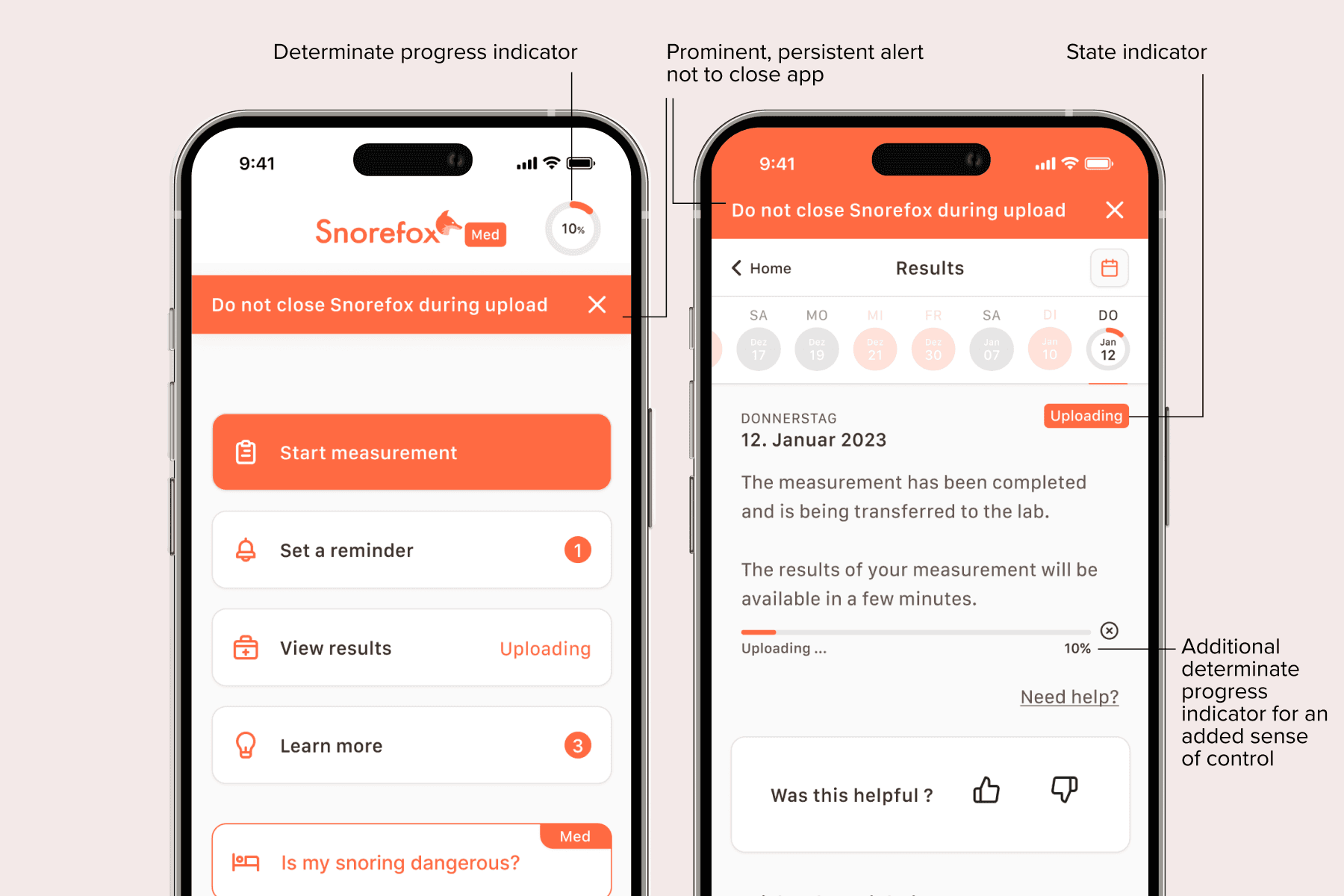
Determinate loader during analysis: Determinate progress indicators—indicators that have detectable completion rates—are not useful if the completion rate of the processes they are indicating cannot be known, as in the case of the analysis process.
Lack of system status: Unless on the upload/analysis page, there was very little indication that these processes were actively taking place.
No warning to keep the app open: There was no indication that users should keep the app open during analysis.
I conducted secondary research and identified three improvements we should make
After conducting a bit of research on around system status visibility, I determined that three changes could drastically improve the experience for users:
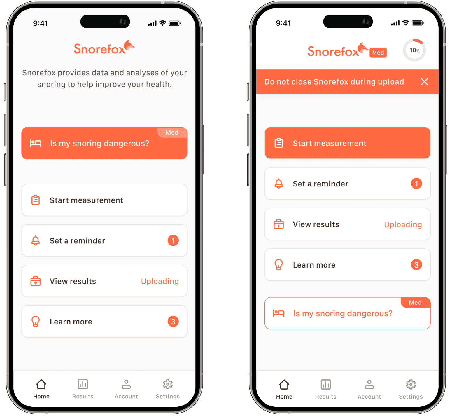
Multiple status indicators to indicate upload and analysis activity
A prominent, persistent warning against closing the app
Switch the determinate progress bar to an indeterminate one to continuously show that the process was active
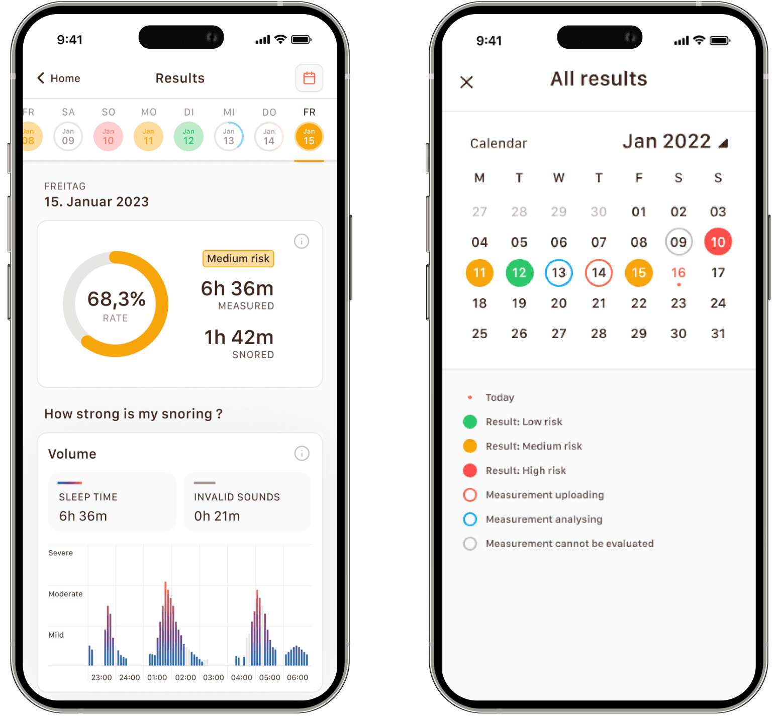
The product owner also requested that I propose a new design for the results and measurement overview screens to make it easier for users to switch between results and view the progress of multiple measurements simultaneously.
Giving control back to the user led to meaningful results
Ultimately, good product design takes just enough control from the user to help them accomplish a task without making them feel powerless. In this case, users felt powerless and were becoming frustrated. Giving them clearer indications of their progress and providing tips on how to minimize upload time gave them back some of this power and helped them to feel more in control. While the PM pursued validation without me, the changes shipped a few weeks later.


Learn more + try the prototype!
In the following presentation, you can read more about the project and try interactive prototypes of the app.