
Burokrat
The 104 hour MVP
Building an MVP to unite the company's three products
Burokrat wanted to launch its three SaaS products as a cohesive product suite
Burokrat, a set of three software tools aimed at helping lay-people with all things data privacy, was the brainchild of five founders from three different industries. At the time, its three products differed significantly in its interaction and visual design, leading to a confusing, disjointed experience for anyone using more than one Burokrat product.

I was asked to design an MVP capable of uniting the three products
I was tasked with creating a more consistent user experience and designing a new sign-up/log-in flow in just 104 hours over three months to unite the product suite. This breaks down to less than 2 hours per work day! Burokrat's product lead and I agreed that a design system would be the most effective and future-proof solution, but were both skeptical that I could get it in the allotted time.

We saved time by re-tooling existing brand assets and applying them to a pre-built component library
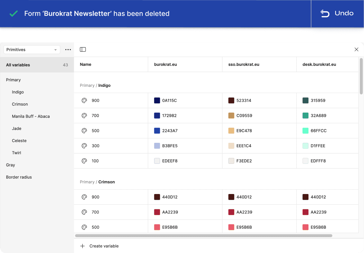
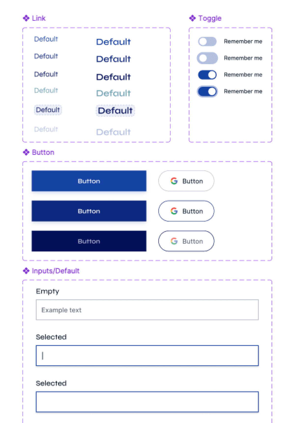
I first conducted a content inventory, which revealed 100+ individual components—not including individual processes like sign-up and log-in, or brand assets like typography and color—that were inconsistent across all three products. It also revealed that it would be next to impossible for me to design that many components in such a short time frame.
We decided to use existing brand assets and apply them to a pre-built component library to create a more compact design system that could easily be translated into increasingly complex layouts across all three products. See the slide deck below for more information on how I did it!
The component library we used: Tailwind CSS

I began iterating solutions and defining the building blocks of a larger system
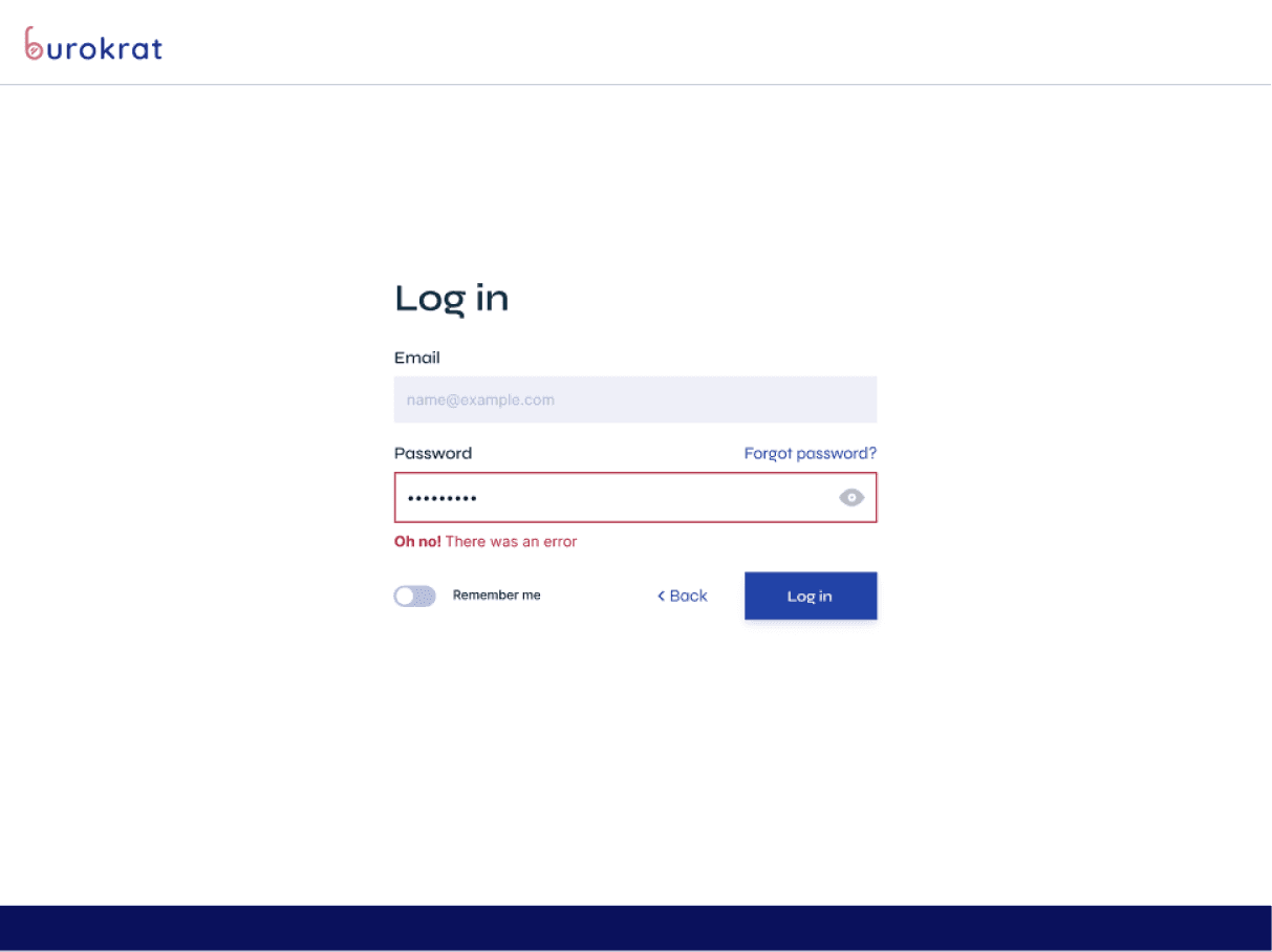
I created user flows and wireframes for the sign-up/log-in process, taking note of the most essential components as I went. In doing so, I defined the basic building blocks of the system, which could easily be taken apart and reassembled into future UI elements.
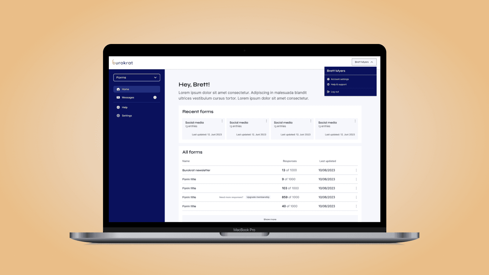
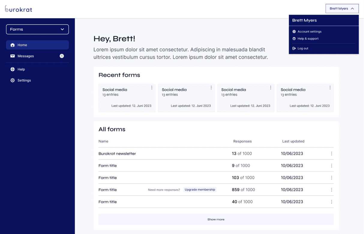
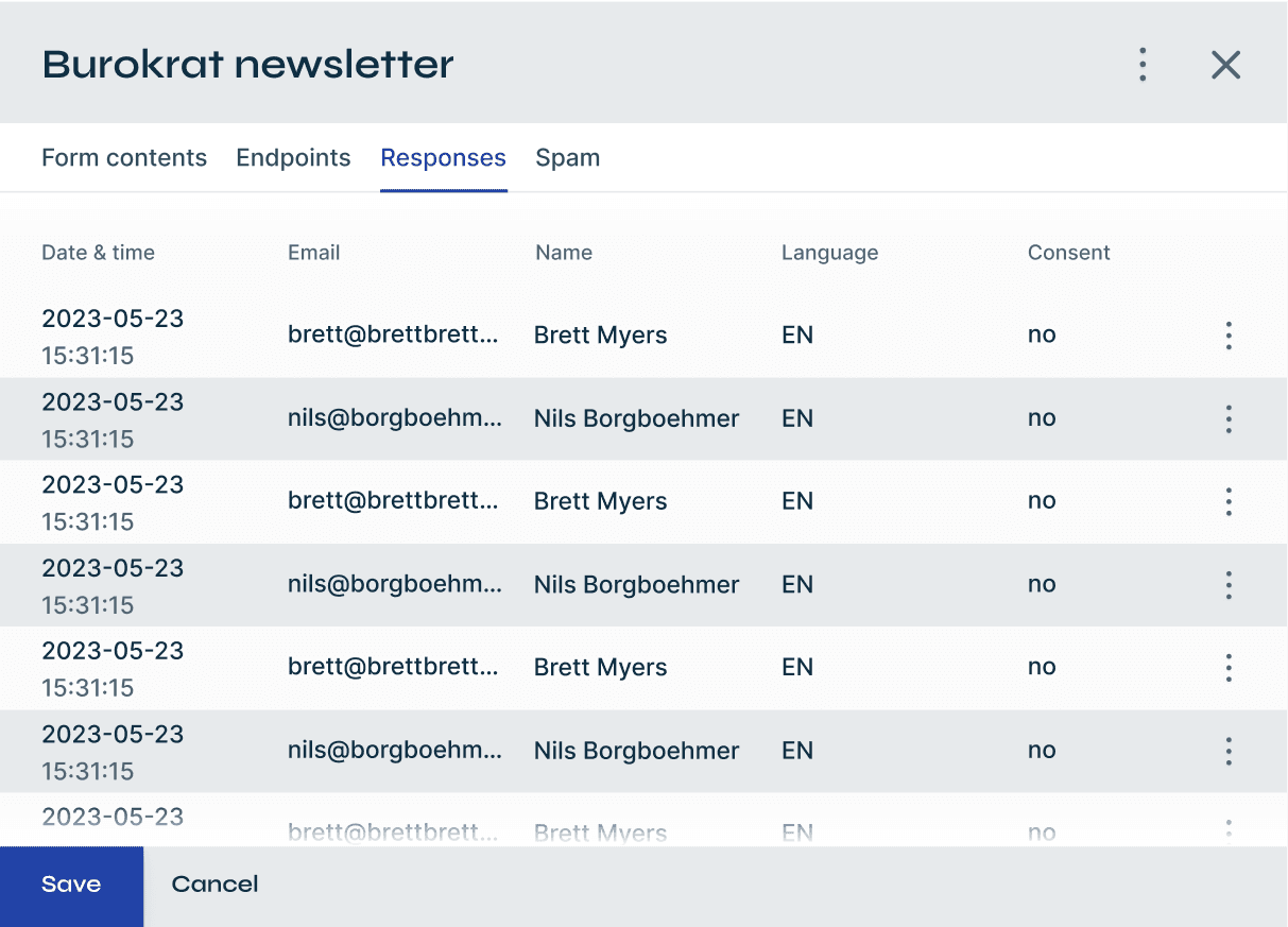
I then created full layouts for the sign-up/log-in process. With ~30 hours to spare, I focused on designing Burokrat's dashboard using the newly formed components. I finished the whole project with ~20 hours to spare!


Learn more via slide deck
In the following presentation, I walk through more of the nitty gritty details around research, how I made design decisions, and more!