Tiger-Algebra
Evangelizing UX as a Design Team of One
I implemented human-centered design practices to decrease user churn and increase organizational design maturity

Tiger-Algebra had impressive traffic but return visitors lagged
Tiger-Algebra’s main offering is a search engine that converts math problems into solutions explained step-by-step.
When I started working with them, Tiger-Algebra (TA) had an average of 2.1 million organic monthly visitors and, to this day, has solved 33+ million math problems. Considering Tiger-Algebra is an ad-powered business, these are great numbers. However, around 70% of these were new, not return users, which meant a great deal of lost revenue.
TA wanted to a fix a few minor UX/UI issues; I wanted to help them reach their full potential
I joined TA in March 2020 to help with a few minor UX/UI tasks, but after witnessing their “build it and they will come” mindset, became determined to right the ship toward more human-centered, “build it so they will stay” product design processes that would, hopefully, help the company retain more of its users.
My secondary goal was to increase the design maturity of the company from an estimated 1/5 to at least a 2/5 on Invision’s design maturity scale.
I used Analytics to come up with a testable hypotheses
Tiger-Algebra's primary competitive advantage (at least pre-ChatGPT) was that its ad-based business model kept it completely free to use, whereas most of its competitors charged visitors for full access. So why were so many of its visitors abandoning the site?
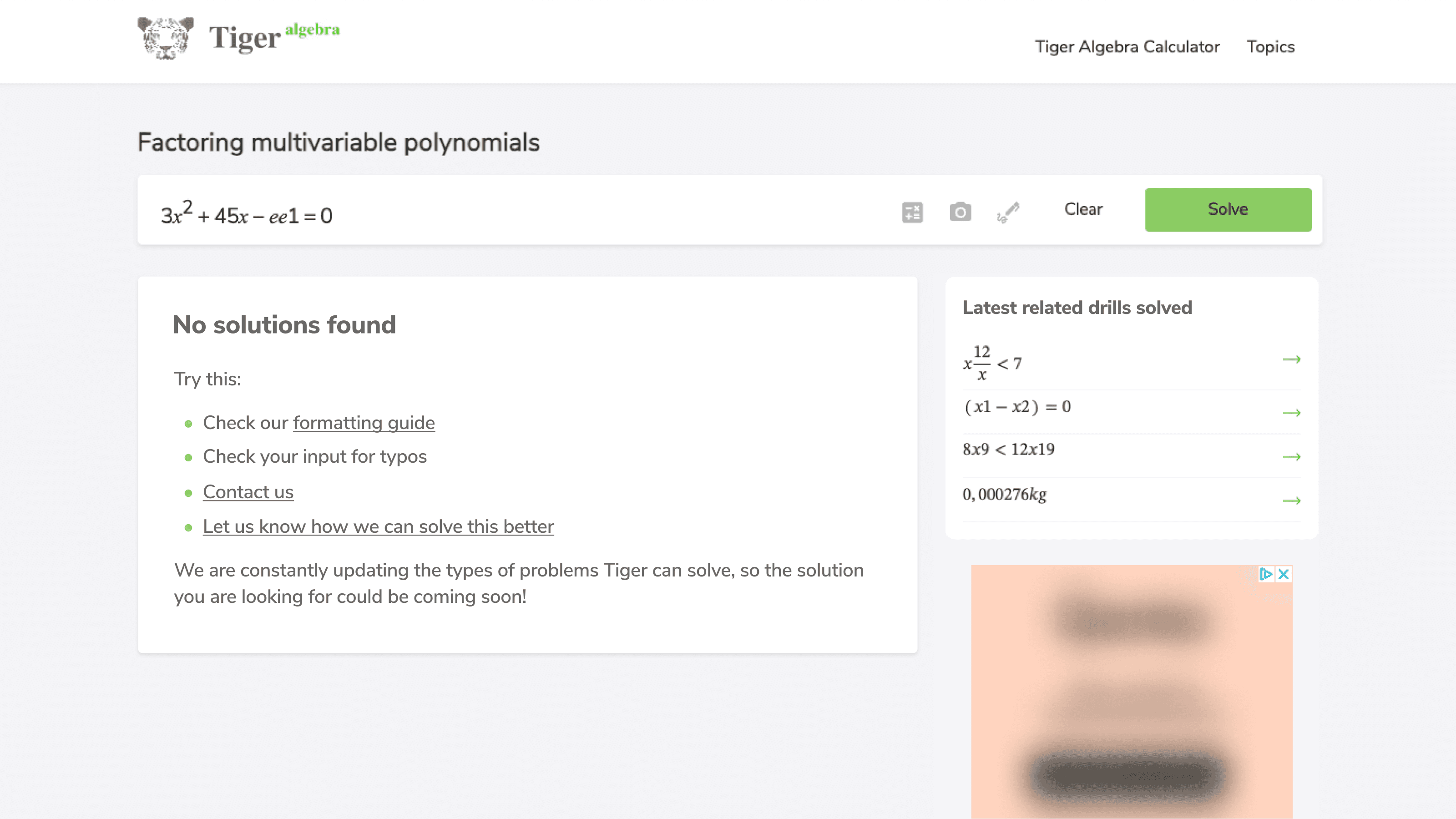
TA’s Google Analytics revealed that several solution types and the “no solutions found” page had higher than normal bounce rates in the range of 70-75%. Having used the site, my hypothesis at the time was that users were struggling to format their searches in ways that TA’s search could recognize and were being taken to irrelevant solutions or the “no solutions found” page and subsequently leaving the site.
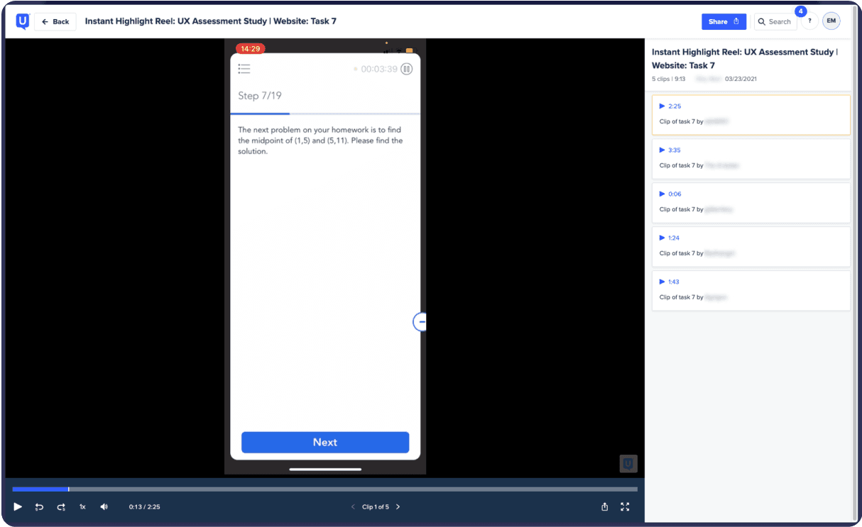
I turned to usability testing to test my hypotheses and led ideation sessions to generate solutions
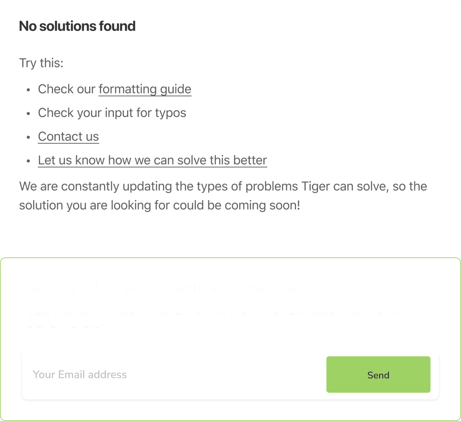
Remote usability testing confirmed my hypotheses and also revealed that “no solutions found” page offered no guidance on how to correct course. It was a total dead end.
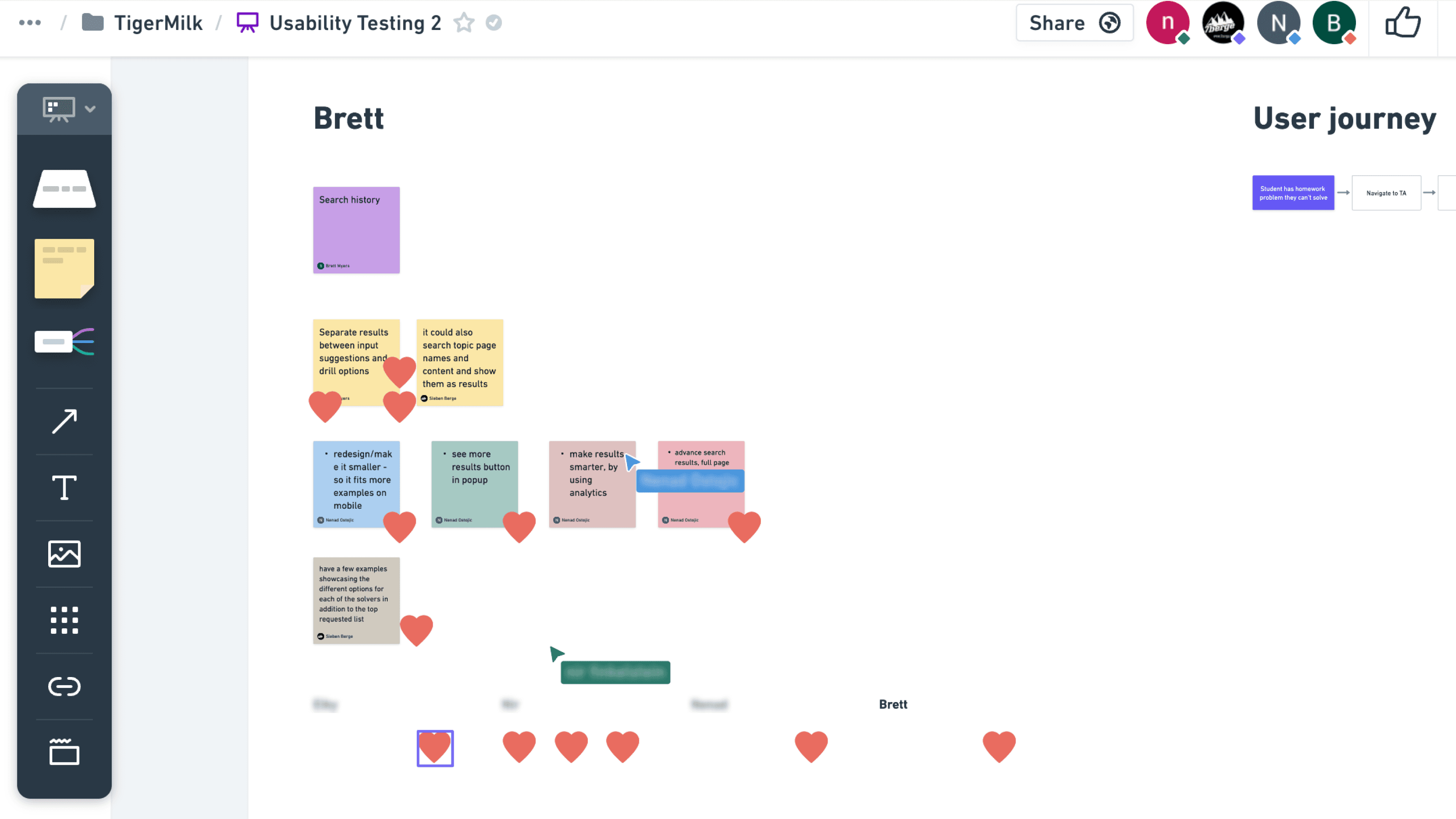
I facilitated two team-wide review sessions of test recordings to ensure alignment and two ideation workshops to develop solutions for the identified challenges. Seeing the problems with their own eyes had a massive impact on team buy-in and our collective approach to product development.
Soliciting user feedback allowed us to quickly build a solution that had significant impact
Because the algorithm TA’s search relied on was relatively inflexible, we did not have many options for addressing the root cause of the problem and decided instead to focus on mitigation and damage control. To do this, we decided on four solutions in two categories:
Preventative
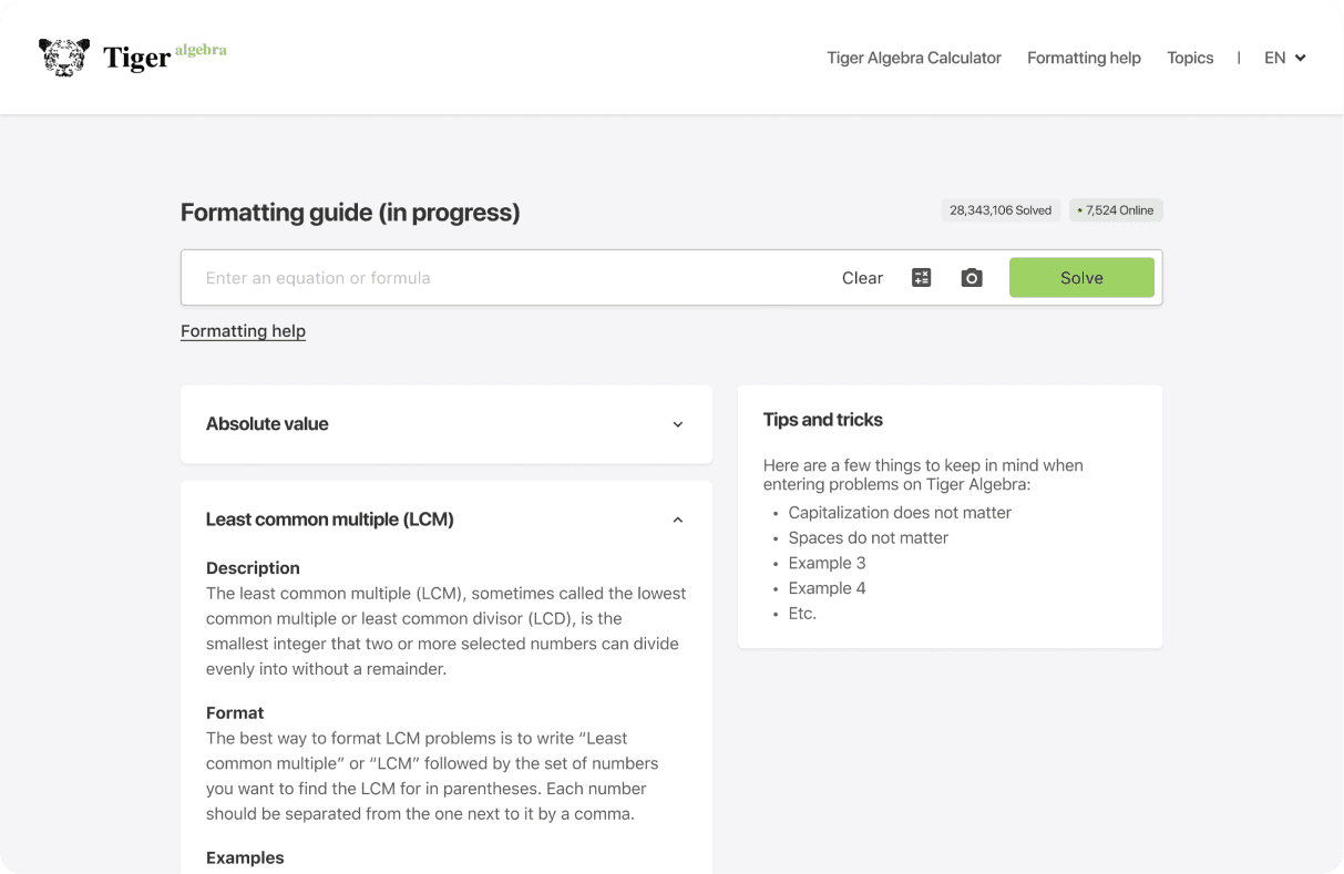
Create a formatting guide to help users with their inputs
Let users choose from a list of search results
Corrective
Add suggestions for improving search queries
If all else fails, give users a way to tell us what happened
These improvements led to a ~12% decrease in bounce rate on the "no solutions found" page, and a ~15% decrease in bounce rate on the solution types targeted in the redesign. Additionally, our “Not what you’re looking for? Tell us more” feedback form garnered 40+ thousand responses in a number of months, a fantastic north star for future decisions about the formatting guide and product writ large.
Learn more about this project!
In the following presentation, you can see how I made design decisions for this project and see other parts that I worked on!


